Most businesses these days have a website. But is that enough to make your business a success? Is it enough to help your business grow and thrive?
I don’t think so. I’ve seen some pretty terrible websites. Here, I’m talking about sites that are arguably worse than having no website at all. They’re amateurish, ugly, and worst of all…
They’re ineffective. That means they don’t do a single thing to elevate the business they represent. They don’t attract visitors, and when someone lands on the site by chance, they don’t stick around.
The problem is that a lot of entrepreneurs and business owners don’t know what makes a good website. As horrible as this sounds, a lot of web developers don’t know. They might have a handle on one aspect of web design or SEO, and completely miss the boat on others.
So, with that in mind, let’s take a few minutes to define what makes a website good. Once you know, you can create the kind of website that attracts new customers.

Information is where it all starts. Your website is your home base online. Ideally, your website should act as sort of a combination plate, something that encompasses a well-written brochure, an attractive office, a professional receptionist, and an ace salesperson.
Whew. That’s a lot to do with a simple website. But, the good news is that it’s not as complicated as it sounds.
Let’s start with the content. Your website must attract visitors – and the only way to do that is to optimize it. That means:
- Picking the right keywords
- Using your keywords wisely – in tags and in your content
- Including internal links to give your site structure and make it easy for visitors to find relevant content
- Using external links to authority sites to back up your claims or inform visitors
It’s also about varying your content, interspersing written content with relevant images, captivating videos, and visual data (like infographics) to educate visitors about your business. You’ll also need a contact page that makes it simple for people to get in touch with you.
Ultimately, your website should tell people who you are, what you do, and what they stand to gain by doing business with you. If you can accomplish that, the informational aspect of your website is what it should be.


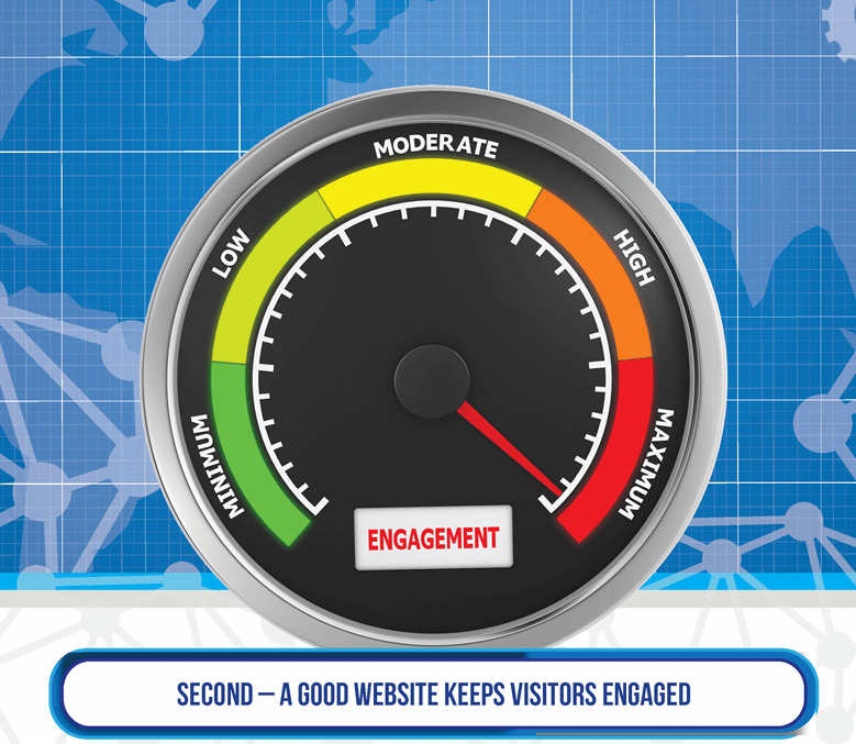
You can have the most beautiful home page in the world. But, if it doesn’t encourage people to read, explore, and stay a while, it won’t matter.
There’s a reason that your Google Analytics tells you the average time visitors spend on your page. That information is valuable. It tells you how engaged visitors are.
Let’s face it, a visitor who lands on your site and spends 90 seconds on a page that should take 10 minutes to read isn’t engaged. And the chances are good that that person didn’t navigate to another page on your site. Instead, they probably clicked the “Back” button and went in search of a more engaging site.
So, what does this mean in terms of defining a good website? It means your site must have:
- Well-written, engaging, valuable content that keeps visitors glued to your page until they’ve read everything there
- Intuitive navigation that allows them to find what they need easily, and navigate your site with a minimum of time spent wondering what to do next
It also means that your site should have a responsive design. Mobile use is on the rise and that’s a trend that’s likely to continue. People using mobile devices won’t stay on your site if it’s not easy to read on the device of their choosing. That means no horizontal scrolling, and buttons and menus that adapt for use on a small screen.

Ultimately, your goal isn’t just to attract visitors to your site. You want to turn those visitors into paying customers. If your site isn’t designed with conversions in mind, then it’s not a good site.
Of course, not every guest will convert on their first visit. That’s why your site needs to present multiple conversion opportunities. Some will focus on turning visitors into leads, while others will focus on making sales.

There are three main features to consider here.
- An opt-in form that entices people to sign up for your mailing list is a must. Once someone gives you an email address, they become a lead. It’s your job to nurture them, overcoming their objections and making it impossible for them to resist buying your product or signing up for your service. Ideally, you should have an opt-in option on every page of your site, not just your home page.
- A strong call to action is the next must-have feature for a good website. Here, I’m not talking about a single call to action. The most effective websites offer multiple calls to action at strategic points. You might have a static form above the fold on your home page, and then include a scroll-triggered form and a pop-up form to capture people if they leave without opting in. You’ll also need direct sales CTAs on your product pages.
- The third conversion-friendly feature to include is a simple, intuitive checkout process. When your checkout process is slow, unwieldy, or intrusive, people may abandon their shopping carts without completing a purchase.
A site that has all three of these features is likely to do a good job of conversion. There’s a missing piece of course. Lead capture is only as good as your lead nurturing campaign. You’ll need to use your email list, social media, and other resources to convince the leads you collect to convert.

… but yours can be. Focusing on these three elements – information, engagement, and conversion – can help you capture leads, nurture them, and earn the profits you deserve.
